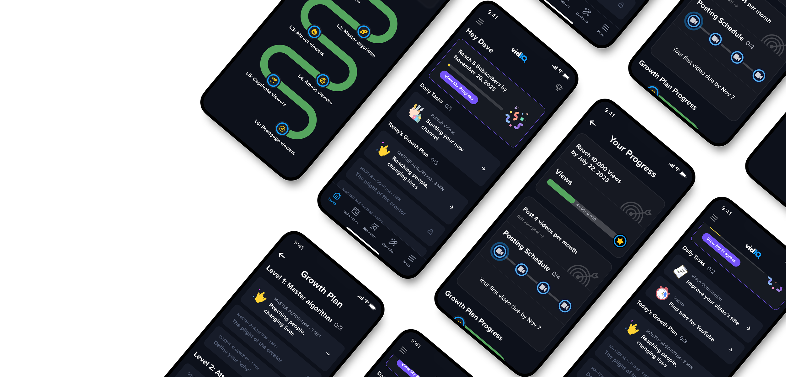
Dashboard
vidIQ Mobile App
Project Overview: vidIQ is a mobile app that helps YouTube creators grow smarter and faster. I designed the coach approach dashboard and the growth plan progress. I worked closely with Dev team and PMs.
My Contribution: I’m the sole designer for this project, responsible for the entire UX and UI design. I also participated in user testing and refined the design based on feedback.
Timeline: 4 months (2023)
Tools: Pen and paper. Figma.
Audience: YouTube creators & Content creators.
Case overview
001
Problem Context
vidIQ mobile is currently a complex product, with lots of data and features. It takes time for users to learn. Yet over 60% of the new signups are beginner creators whose channels have less than 100 subscribers. For these beginners, the product is too overwhelming and it doesn’t help them learn Youtube as beginners.
The Solution
The coach approach will solve this challenge by providing users with simple, straightforward plans that guide users how to grow their Youtube channel.
The coach approach will consist of
Setting goals and tracking progress against goals.
Bite-sized educational lessons that teach users YouTube best practices.
Daily tasks personalized to the user’s channel that are designed to keep the user on track to meet their goals.
Final design
002
Already curious? Here are some screens of the final design in dark mode.
Goal Tracking
The first tab on the dashboard shows the user’s progress toward the goal set during the onboarding flow.
When clicking ‘View My Progress,’ another page will open with the goal tracker.
The goal could be X subscribers or X views, depending on what the user selected during the onboarding.
Daily Tasks
For a brand-new creator, the first daily task will be 'Starting Your New Channel.'
Normally, we show two daily tasks per day to users who already have their YouTube channels.
After clicking on the tasks and completing them, the user will get to see a checkmark indicating that the tasks have been completed for the day, and they can come back tomorrow for more.
Video Publishing Tracking
As part of the onboarding process, users select their preferred level of commitment (e.g., Goal Commitment Level), and the screens show the UI for users who selected to publish four videos per month.
Users can click on each video icon to see the due date. When they uploaded a video, the corresponding icon will be turned into green with a check mark to show that they’re on track. If they somehow miss the due date, the icon will be red with the X.
Today’s Growth Plan
In Today’s growth plan, the user will find the lessons.
A user can only complete a limited number of lessons per day. They must come back the following day to complete more Lessons.
In the second screen, you can see that this user has completed their three Lessons for today, and must come back tomorrow for more Lessons.
Course Map
Under the video tracking feature, users can also see the course map. It reflects which courses the user has completed already, which course the user is currently suggested to the user, and which courses are available in the future.
The course map allows the user to see what lies ahead and should ideally excite them for the future courses.
Business impact
003
Users of My Progress are showing very high retention.
About 43% of users of the coach approach dashboard also view the My Progress screen.
Retention of these users is at 70% with D1.
73% of users of the dashboard are showing high engagement with lesson & daily task.
Day 1 retention is higher by 3.8% for coach approach dashboard.
Overall, during the A/B testing, the retention rate is up 2.6% compared with the legacy dashboard.
Design process - V1
004
Based on the product requirements and the competitive analysis, I created wireframes and some explorations for the key features:
Design process - V2 improvements
005
Based on 1st explorations, we conducted usability test at usertesting.com. Here are the key decisions based on the feedback:
• Deferred progress indicators & status visibility to the dedicated progress page.
• Added ‘My Progress’ in the upper right corner for easy access.
• Displayed 2 tasks at a time in a vertical scroll instead of side scroll.
Next step
006
Expanded, personalized task center. The task center will first focus on new user experience and include a limited, fixed set of tasks with very little personalization. Over time, this task center should expand and become personalized to the things we recommend users do based on their unique personal channel.
Notifications for goals. We will potentially deliver push notifications and/or emails for users to keep on top of their goals (e.g. “you haven’t posted your video yet this week - try posting one to keep on track!”).
Mobile push notifications. We will expand to additional mobile push notifications at a later quarter since onboarding moves our product vision further than push notifications.

